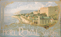
 Another important hole the user interface must fill is to serve as a scene to illustrate the feel of the game, and this is what I design for. Talking in our group, we already had some basic ideas for what the user interface should look like. One idea was to base it off of 1950's postcards, particularly the one to the right:
To being this, very, very rough pencil drawings were made to basically represent some ideas, including the postcard idea among them.
Included with these initial concepts is a Word Document that explains what each scene would have present in it, and how each one would be presented. It then goes on top talk about what we thought worked and didn't work after group discussions on the matter. Eventually we came down to either using the 2nd design along, or the 3rd. The third best represented what we wanted for a "1950's postcard" look, an thus was developed further digitally in Photoshop, while still keeping it rough.
These images are some variations of what we got. The top left (1) image shows the original idea in digital form. The Word Document included with these concepts in the project folders explains what worked and didn't work about it, and using this information I created three further alternatives.
Later we decided that the 1950's postcard look would not be used as a user interface, but rather used as a loading screen for each level of the game. The other design that got attention as a user interface was design 2 on the initial designs. This would require a 3D scene to be made up for it to work as intended, but we felt it would work the best overall. Further development of this is still under-way, but for now we are focusing more on mechanics with this as a side project.


